| GP | AR | UV | Overall |
|---|---|---|---|
| 4 | 3 | 4 | 4 |
Review by DrCrypt
Pretty good level, but no where nearly as good as the prequel, 6fiffy1. The main problem with this level is that a lot of things that, in 6fiffy1, George Fiffy does so perfectly, is done incorrectly here. Overall, this is a nice level: I enjoyed many touches to it, but in some ways, it sincerely shoots itself in the foot with the very tricks that made 6fiffy1 such a good experience.
For one thing, the Reject map is, yet again, not built! Argh! King ReoL, why do you err so? Again, I have to dock him a point for gameplay, because it slows the level down to unplayable levels without the reject being built. I spent 35 minutes building the reject map for this level (more than I spent playing it), which is ridiculous... most maps don't take more than a few minutes to compile on WARM. So what's wrong here?
 Well, essentially, it is that the level is needlessly complicated. In 6fiffy1,
this was handled tastefully... but in this level, a lot of the extra linedefs,
etc. are just flamboyant. For example, there is a lot of usage of "arches"
in this level. In 6fiffy1 they were rare and, when they came up, they
looked good. This isn't the case with a lot of these arches here... for
example, the "circular" tunnel of blood you have to travel down at one
point, which looks pretty bad. In some places, all these extra linedefs
look pretty good, but in most cases, they seemed something that could
have been accomplished just as easily without. 6fiffy1 didn't slow up my
computer because of these arches, because they were limited... 6fiffy2
does, however, and so it's annoying.
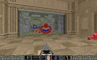
Architecture, overall, is really good... George Fiffy knows how to build some really nice rooms. I just don't think that they are as satisfying to fight in as 6fiffy1. All the breakable windows are still in, but they are pretty much all show, this time, as opposed to positioned strategically in 6fiffy1 for some great gunfights. One thing that George Fiffy seems to have down pat is using the monster "palette" of DOOM 2 correctly: he never puts you up against something that you can't handle at the time with your current weaponry and places monsters in settings where the architectural advantage towards either side isn't too abundant. This people, is the -key- to a good level. The fights in this level are still fun and frantic, just the settings aren't as good as in the last level.
The first outside area of this level is beautiful to look at, with a castle behind you (presumably the same one you left in 6fiffy1) and a canyon before you, complete with buildings leading into the mountains and a flowing river of blood beneath a bridge. Other parts of this level that come to mind are a really nice library and a great green marble hall with a lot of arched pillars in it. Both these areas, however, suffer a bit from the overcomplicated syndrome, and slowed my P200 down. No no no.
One criticism I had was with this home-mad graphic that is used as a door texture in a couple of places in this level, sort of the "ReoL Tough" logo. The graphic is dreadful and very cartoonish (it even has two cartoon mascots on it) and really defeats the mood of this level. It is too small of a thing to mark off for, but really, the graphic is so juvenile, I would highly suggest replacing it.
Overall, this is a really good level. I'm marking gameplay down one point for not having built the reject and two points in architecture for overcomplicatedness and slowdown, plus some "ugly" spots.. Go get it. A note to George Fiffy, if he's reading: a) start building rejects to your map, b) stop putting the text file in a !!read.bat , and c) stop using that damn "ReoL Tough" graphic. It is horrible.