| GP | AR | UV | Overall |
|---|---|---|---|
| 4 | 3 | 3 | 4 |
Review by Colin Phipps
"Back To Hell Episode 1" is a set of 7 levels for Doom 2, a beta release of a larger project to come. It's mostly in an industrial/tech style, but each level had it's own theme. There are lots of new graphics imported which are used mainly in the later levels; many of these were familiar, from projects like Mememto Mori.
 Gameplay varied between levels; all of the level have some good fights and
secrets, but the quality of fights improved as the episode went on, in
particular with more traps. Also some of the middle levels had rather boring
level progression.
Detail and gameplay veried quite a bit between levels, so here are my comments on each level:
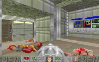
- MAP01 is nice level, with a good tech/acid base theme. Lots of good detail like computer consoles, acid falls; there were a couple of bland corridors, but otherwise a good looking level. The level progression is very non-linear and interesting. Not many traps, but there is a good pistol start, and most of the level you fight with the chaingun; the enemies are a mix of troopers, chaingunners and imps, not that hard but interesting, good for a starting level.
- MAP02 is a more Doom 2 styled map, but there wasn't a clear theme, with bits of high-tech, rusty metal, rock and brick areas. The indoor bits were generally good, but a couple of the courtyards lacked detail. The level was harder, and more intense; there were many fights where you have no easy retreat. OTOH if you didn't find the super shotgnu secret at the previous level, this one would be tough. Again the level progression is interesting, and there are secrets.
- MAP03 is another Doom 2 style tech level; nice use of crates, computer consoles and gratings to add interest. There's another rather bland brown outdoor area, although the shadowed overhang is good. The level is more linear, although you have to double back once to hit a switch. The architecture and traps make some good fights.
- MAP04 is very reminiscent of Underhalls (Doom 2 MAP02) and Waste Tunnels (Doom 2 MAP05); the style is good, although not that detailed. All 3 keycards are used, but it's a pretty linear level, usually the keys are very close to the doors they release. There are some traps, although there are texture misalignments that give some of these away. There is a good range of monsters and some tricky fights.
- MAP05 is back to a more Shores of Hell style level, mixture of stone and computer textures. It's pretty stylish, lots of open courtyards/corridors with overhead beams. There are some good cramped fights, where you go through a door or acid area, or drop to a lower level, which makes them a bit more intense. There are some good secrets, and a non-linear level progression.
- MAP06 is a stone and brick style level; pretty stylish, some very good areas I thought, although there was one area at the end with beginner-looking waterfalls that I felt was a lot lower quality than the rest. There are some areas which are modelled on other famous levels (several places reminded me of Memento Mori); there are some really good fights, clever traps. I took a lot of damage, but there's plenty of health (including a megasphere) to see you through.
- MAP07 has a rock, brick and water theme, with lots more of those blue waterfalls. The indoor areas were pertty cool, with good lighting, and detail like wooden beams, water, and other decorations. Outdoor areas weren't so impressive, with those big blue waterfalls looking sort of silly in the bright; also the waterfalls didn't all make sense (after all the water has to come from somewhere), but then again maybe I'm being too fussy about realism :-). There are lots of traps and some good secrets, and plenty of good fights; you often have to use the architecture to find a spot to fight from.
The music was changed for all the levels in the episode, with music taken from various levels in Doom 1, Memento Mori and such. Overall, there are some good levels here, mainly the first map and a few of the later ones. Hopefully when the project is completed it'll be even better :-).