| GP | AR | UV | Overall |
|---|---|---|---|
| 1 | 2 | 2 | 2 |
Review by Colin Phipps
I ought to be better at this by now. About 5 years ago, I started out playing all the Doom 1 levels in the idgames archive in alphabetical order, and was surprised to find that a fairly decent proportion of the levels on there didn't fit the stereotype (of random polygons decorated in misaligned STARTAN textures). But since I gave up that approach, and started playing levels randomely, I seem to end up with a lot more bad ones. What makes it all the worse is that I try to shift the odds by checking if the text file looks like the guy knew what he was doing — and I seem to do worse than I did when I was playing sequentially…
Anyway, to Ganymede.
It doesn't quite fit the stereotype, instead the start room was a random
polygon of full brightness computer textures, which is the second most
(un)popular feature of bad Doom 1 level design.
It also has a bad classic music MIDI as a music replacement,
another standard feature of bad Doom 1 PWADs.
The text file said "Constructions that you have never seen
before"
, which if I had been in my cynical frame of mind I
would have known meant that the author used ten times more sergeants lined up in
one room than any sane person would use.
 The gameplay is mostly dire. The start room has a nicely formed column of
sergeants to gun down, and that sets the theme for most of the level — most
of the enemy are just lots of imps and former humans just standing around in
the rooms and corridors. There are no traps or secrets. The level
progression is at least not void, you do have to work for the keys, and
there are one or two switches to hit — although these only occur in the
later parts, the early areas are very basic.
There is one teleport which chucks some imps around in areas behind the
player, and there are some maze-like tunnels in a couple of places where the
player has to keep an eye out behind for wanderers; together with the sheer
number of enemies this keeps the player pretty busy and certainly prevents
you getting bored.
By the way my cynicism earlier is only half right — the
"Constructions that you have never seen before"
can refer at least to the auditorium later in the level (well, I'm sure I've
seen auditoria in Doom levels before but I'm being generous) — this holds
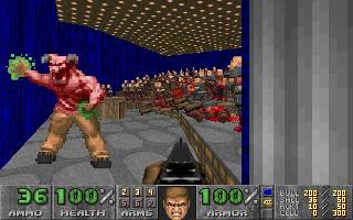
the only heavyweight enemy in the level, a single baron, plus a horde of
sergeants crammed in so tightly that they can't move.
It clearly occurred to the author that the hordes of monsters were unusual
—
in fact there must have been performance problems, because he's run the
level through a REJECT builder, probably a distance based one with the sight
distance set right down, to the point that monsters don't see the player
until you're right in their face. This is very noticable in play and
adds to the poor monster placement.
Actually, reading the text file again afterwards I found that the author
only tested on skill 1/2, because the level was too slow on his 486 at
higher skills. Gee, thanks.
Back to architecture. While the general theme here is also dire — empty cuboid rooms with little decoration, or networks of monotextured corridors — as you get further into the level it starts to pick up. There are stairs. Then a lift, and a window. Then curving stairs and a river. Then a railway tunnel. A tomb. Keycards on pillars. While the early parts, and most of the level, remain very primitive, more interesting areas start popping up which show a lot of promise. The texturing remains basic and there are misalignments, and some structural/nodes problems I spotted. But by the end there is even a store room with a balcony around it and lots of crates scattered around, the kind of room that shows a much higher quality of level design, and just makes me think "well if you can make stuff like that, why the heck did you keep junk like the computer nightmare at the start?".
Overall, this level doesn't even make first base for quality. The gameplay is mostly mindless gunning down poorly placed hordes of basic enemies, and most of the architecture is strings of empty rectangles. The player is kept busy, and it does contain quite a few glimpses of better ideas and more confident editing as you get further into the level. It qualifies as fun if you like a good slaughter and don't mind the setting.