| GP | AR | UV | Overall |
|---|---|---|---|
| 4 | 4 | 4 | 4 |
Review by Colin Phipps
Another big Doom project comes to completion — at long last. Surely it has been over five years since I saw the Hell Revealed 2 website go up?
Hell Revealed 2 is a 32-level megawad. As seems to be obligatory these days, the episode comes with new music, new menu and new status bar graphics. As in Alien Vendetta, the new menu doesn't work too well with the ports, as it replaces the menu title image with the whole menu, instead of replacing the individual menu item graphics, so it doesn't work right in ports that reorder the main menu. There are some new textures too, but, except for one or two levels, these are used sparingly.
For once, I will leave the review in the order that I write it: that is, writing up the individual levels as I go along, and drawing it together at the end.
- Ignition! by Jonas Feragen —
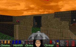 This is in the industrial Doom 2 style, with a small cement industrial base set in a small valley with a nukage lake. It feels rather like a deathmatch level: the base is rather too small and the layout is implausible. There is some good architecture including over-under bridges and good use of nukage; but apart from these details the level is uninteresting. The action is good, with a sharp opening fight, limited health and ammo, and plenty of enemies appropriate to the terrain.
 - High Voltage by Jonas Feragen —
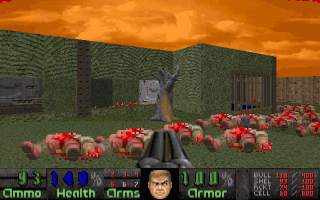 Similar industrial and nukage style to the last level. This level has lots of nice architectural features, with barred windows, keycards on pillars, and windows and walkways over an acid lake. The straightforward fights are not very challenging; apart from a good initial fight, most of the other enemies are packed into small rooms without any challenging placement. but the traps and secrets are good.
 - Shackled by Jonas Feragen —
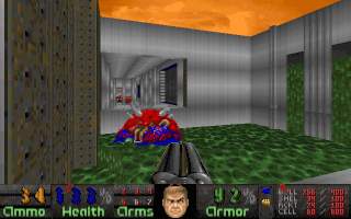 A nice cement base level, with a series of buildings built around a lake connected by metal walkways. The layout is used to good effect, with windows between areas giving the player more than one direction to look in. There are some good, but nasty, traps, and some secrets. Some of the fights can be a bit of a grind, with lots of one type of enemy used at a time in a compact area, to be killed one after another; apart from this complaint monster placement is good, and there is a good mix of moving and defensive fights.
 - Reluctant Pain by Jonas Feragen —
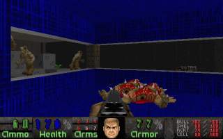 A nice bricks and metal base level. The monster placement at this level is excellent, with diverse mixes of monsters used to attack the player in different ways and from different directions. There is still a high proportion of nasty traps, but with less health available at this level there is much less tolerance of mistakes; with tough traps like this, and no plasma or BFG yet, the player can lose a lot of health to each surprise which cannot be easily regained. The architecture is good, with overlooking ledges and windows between areas used to make things interesting.
 - Insatanity by Jonas Feragen, Afterglow —
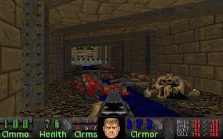 This level is small but the architecture is good. There are lots of interesting features, including some good water features, and details like metal beams in the brick passages. There are a couple of tough fights; these are both brutal, with a high risk of dying, and unforgiving, because the level is devoid of health.
 - Revival by Cyb — A rather odd industrial-style level. The level is rather flat and bland, and while parts are detailed, I found much of it bland and unconvincing. There are also odd anomalies, like walls hidden on the map for no reason, and traps or secrets revealed on the map — at least one secret is required to complete the level. There is some tough action to keep you busy; the simple layout gives little room for cover or manouver, and there are some strong monsters and traps used.
- Not So Simple 2 by Jonas Feragen — This is a potent Dead Simple (Doom 2 MAP07) replacement. You start in the classic yard-with-mancubi-on-pillars scenario — but this is far worse, because there's an archville in the yard too. I don't remember ever seeing this simple setup before, but it is an excellent harder version of the original MAP07 concept. I suspect I played it in a way the author did not intend though — I let the archville lift me over the wall of the yard and fought it from outside. I don't think the escape was intended, but it still plays well. There are several other tough fights to beat later in the level, including some good hordes of monsters with plenty of ammo to go with them. The architecture is not that detailed but is sufficiently grand to carry off this kind of level.
- Ballistics by Metabolist —
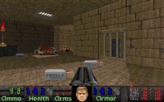 A fairly small level based around two courtyards overlooked by barred windows and ledges on all sides. The layout is simple but effective, with lots of hell knights firing down into the yards from different directions making for some quite tactical fighting, as the player tries to clear the overlooking ledges without being shot in the back. The style is very much Doom 2 industrial, with mainly brown brick and stone used. An absurd amount of ammo is provided, proving that this author comes from the ammo-boxes-as-decoration school of level design.
 - The Siege 2 by Jonas Feragen — This is a simple concept map: the player is trapper in a cage with tons of ammo and limited cover, with hordes of revenants outside shooting in. The pain elementals and cacodemons, which can float in over the top of the cage and descend on the player, are a nice touch. The player is neither totally exposed, nor is there any entirely safe spot inside the cage, as at least one of the open barred sections can see you wherever you stand — the balance is just right, giving you a fighting chance but never a moment's rest.
- Base Blaze by Gemini —
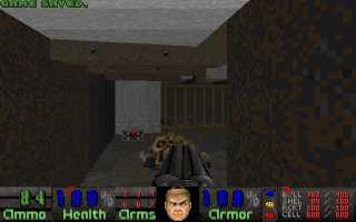 A small, industrial style level. The architecture is good, with varying floor levels, and details like computer panels and metal beams. The level tries a kind of joke on the player, where the keycards are immediately behind doors at the start, and it seems that the level will be completely trivial — and then, surprise, the exit is fake and you are forced to do some real work. The joke falls rather flat, because the level is still rather trivial even when you get past the fake exit. Despite the good detailing, the areas are all small, there is little interconnection between areas: there is no heart to the level, and the areas feel lifeless. The gameplay has the same problem: a sequence of small fights, no secrets, and only one significant trap — compensated for by tons of health and ammo (except it is all misplaced too early in the level).
 - Raw Hatred by Cyb, — A Doom 2 tech-style level. The architecture and ambience are good, with lots of detailing, solid structures, connections/windows between areas, and good texturing. The gameplay is solid, with good monster placement, in particular some good use of archvilles. There is tons of ammo, but you need it; and there is a rare good use of an invulnerability in the last big fight, where you have to cut past a cyberdemon and a horde of barons to take out a couple of archvilles.
- Anti Static by prower — A bricks and metal style level, set in a large courtyard containing a few scattered buildings. The fights are all big open-air battles in the yard, as each trap releases ever larger numbers of monsters into the main yard. With tons of ammo, the main challenge here is the archvilles, which are released in packs of four or eight at a time, which combined with large numbers of other enemies makes it very hard for the player. It's all about finding a spot to defend and holding out against huge numbers of the enemy.
- Hardcore by Jonas Feragen — A remake of Dead Progressive (Hell Revealed MAP25). This is a bit larger than the map it clearly imitates, but the fundamental design is the same: a yard divided by a number of buildings, with lots of arachnotrons in the yard and mancubi and barons in the buildings, plus lots of traps that open later on releasing archvilles, revenants, and the odd cyberdemon or spiderdemon. I like levels like this, as the design is only important in so far as it provides an interesting setting to play in: most of the gameplay lies in finding tactics to beat particular fights, to get monsters fighting each other, and finding somewhere safe to survive the onslaught.
- Metal Meltdown by Metabolist —
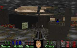 This level starts with an excellent opening fight, with a room of hell knights and chaingunners that keep the player trapped in the tiny start passage. The rest of the level promises much but comes to little: there is one loose cyberdemon that can be used to kill off most of the other enemies in the main area; the side areas have no particular challange; and the four other cyberdemons don't have to be fought. The architecture is good, with a rusty metal theme (like The Crusher, or The Twilight).
 - The Path 2 by Jonas Feragen —
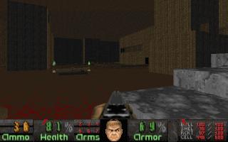 This is a huge, impressive level. While it is clearly a clone of The Path (Hell Revealed), and repeats many of the ideas from that level, it is sufficiently new, grand and impressive to stand as an excellent level in its own right. The same basic style — huge lava caverns, with a snaking path leading through them overlooked by ledges and powerful enemies — is used to make a new and challenging level. The gameplay is very tactical: the caverns offer little cover, so the player has to find safe areas to fight from, and when moving forward you must always be wary of distant monsters sniping at you. There are large numbers of enemies, and early on ammo and health is limited, so you have to take every chance to get them fighting each other. Later in the level the player is fighting more in side areas, and these are full of overwhelming traps and some very unusual fights.
 - The Chapel of Black Granite by Metabolist — The main areas of this level are fairly crude: the main hall, containing a cyberdemon and two large imp cages, is very basic, and several of the other main areas are similarly lacking in detail. The side areas, in which most of the action takes place, are more detailed, with better attention to detail, lighting, fixtures and some secrets to find. There are some tough fights in the side areas, with very limited space, and some good battles where you have to get the enemy infighting. But others are a rather dull slog, like the horde of demons in front of the exit.
- An Eye For An Eye by Gemini —
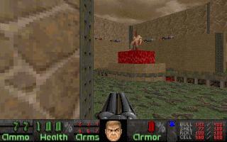 This is a bricks and metal base. Like other levels in the episode, this one uses lots of tough monsters, but it makes good use of mixing the different types to keep things interesting. Monster placement is good; there are a lot of well-placed archvilles, for instance, so that a quick player can pick them out from the crowd before things get too nasty. There is good use of chaingunners and other weaker enemies to harass the player too. The level has lots of good traps, and the architecture is to a very high standard, with particularly good attention to lighting and fixtures.
- Excess Meat by Jonas Feragen — This level is a mixture of indoor industrial/nukage rooms and ourdoor yards and a river canyon. The level consists of several distinct fragments joined together by teleports. The level progression is unusual, as the teleports to the different areas are only revealed gradually as the player completes earlier areas, as well as keycards being needed to access certain sub-areas; the way ahead usually does not take long to figure out, though. The fights are mostly big battles, with hordes of revenants, cacodemons, mancubi, or multiple cyberdemons to deal with; but there are plenty of smaller fights too.
- Mind Trap by Jonas Feragen —
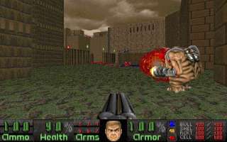 A large level, consisting of a several complex buildings set in and around a canyon. It is somewhere between the tall-buildings-and-city-streets style of Downtown and the base-in-a-canyon style from levels like the KBoom and KHills series. Initially there are large numbers of monsters in the buildings and on ledges overlooking the player, making for some good early fights; the player then has to get up into the buildings, gradually clearing them and hitting switches to gain access to new areas. The good use of vertical space, windows between areas, and ledges in other buildings shooting at the player keep it interesting throughout. There are plenty of traps and interesting fights once inside the buildings. The architacture is good, with impressive outdoor areas, and good lighting and other detail in the indoor areas, as well as some clever special effects (in particular a 4-tier bridge-over-bridge feature).
- Fear of the Dark by Martin Friberg — As the name suggests, this is a gloomy, dark, atmospheric level. There is very good use of acid, computer panels and other decorations, and good lighting (albeit a bit too dark in places). The level consists of a series of areas built off of the octagonal start room, and much of the fighting takes place as monsters force their way in, or teleport into, this area. It makes a good arena for a series of fight, including a couple of cyberdemons to tackle. You can see the big traps coming, but they are still good fights.
- Conflux by Jonas Feragen —
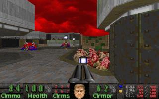 This is quite a stylish tech-base level. The level is small, but there is plenty of action, with a cyberdemon, a horde of barons and a number of archvilles being teleported into the main area as a succession of traps are triggered. The best fight is in one of the early areas, as a number of revenants are used in cramped conditions to get at the player; the rest of the fights do not put the player under much pressure, as there is space and plenty of rockets. The architecture is very good though, with the stylish use of floor lights, curved steps, nukage and crates making this feel from a much more modern school of level design than most of the other levels in this series.
- Sewer Slaughter by Gemini — A good sewer level, which creates a dank, murky atmosphere with good use of water and subdued lighting. There is some excellent attention to detail with the lighting in particular, with corners properly lit and even some cleverly done broken light fittings. There are some good traps and secrets, although the easily obtained computer map takes away some of the mystery. There are a number of very stylish rooms and unusual fights, with good use of mixing weaker monsters among the stronger ones to make things more interesting.
- When The Heavens Fall by Martin Friberg — This is a big industrial/tech base. The architecture at the beginning is rather crude, with a couple of large, ugly, oddly shaped stone yards. But once inside it looks much better, and there is some good use of computer panels and crates in some areas for detail. The level consists mainly of a few big fights and traps; there is a good mixture of weaker and stronger monsters, with some traps consisting of archvilles and revenants, while others make use of lots of chaingunners. Some of the traps are rather nasty, and it can require a pretty precise and sharp movement to escape them. There is a good outdoor area with a cyberdemon overlooked by a lot of barons and revenants.
- The Inmost Dens III by Metabolist, Andy Olivera —
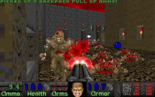 Now this is a really good level. This one somehow reminded me of some real classics — Requiem, or Memento Mori, in fact it's a bit like The Stand (Memento Mori MAP04) — because of the really good architecture, complex structures, overlooking windows, and complex gameplay thanks to lots of monsters and plenty of crossfire. The level is a great mixture of more standard Doom fights, with lots of monsters of different types in the yards, or overlooking from the windows, and also a few really tough battles, with archvilles teleporting in, or a cyberdemon, or a horde of cacodemons. Interesting layouts, plenty of big battles, and some excellent traps and secrets.
- The End is Nigh by Metabolist, Andy Olivera, Pedro Blanco — This is a strange level, in a kind of Doom 2 Hell style, with a mixture of large gothic halls and outdoor yards, and some industrial/tech indoor areas. The gothic parts use some high quality new textures, but these seem a little wasted on the basic cuboid architecture, and they seem out of place in an megawad — individual levels in a megawad can rarely get away with introducing a whole new texture theme. The outdoor areas are basic, instead it is the action that dominates — but since the yards have no cover and tons of enemies, they can only be fought by waiting outside until the monsters have killed each other. The level is better later on; the cement-and-metal indoor areas are an odd contrast with the earlier parts, but with limited space, some good traps, and a better mixture of monsters, they are more interesting.
- Dis 8000 by Pedro Blanco — This is a quite stylish Inferno-style level. It is in part inspired by the original Dis (Doom 1 E3M8), with the star-shaped main hall and a big fight with 4 spiderdemons at the end. But this yard is also used for a number of other big fights; the layout, with lava in the middle and only a small marble walkway around the outside connecting the main entrances, makes this a tough area to fight, with little cover and the enemy kept at an inconvenient distance from the player. New monsters are released into this area at several points as the player progresses. There are also some large side areas, which house a number of other big fights and traps. While the level lacks detail in areas, it is a good level in the Inferno style, and there are plenty of interesting fights, thanks to unusual layouts that deny the player easy cover.
- Resistance Remains by Metabolist, Andy Olivera — A Resistance is Futile (Hell Revealed MAP22) clone. It is a scaled down version of the original; the yards are smaller, the monsters are less mobile, and it is easier to get them fighting each other. The side areas are new at least, but given the vast amount of cells provided, they do not pose a serious challenge to the player. I was rather disappointed: what's the point in a sequel if it is easier? That said, there are a few tough new fights, and the final trap is good.
- Beyond the Sea by Andy Olivera — A Doom 2 style level, with a mixture of brick and cement texturing. This is a level made up of a few large areas, and correspondingly large fights. Due to the size, some areas can be a bit bland; only the southern part of the level has much detail. The level progression is complicated, with lots of switches to hit, and the way forward is not always clear. Some fights are repeated several times, which gets a little repetitive. There are some good secrets and trap.
- Hell's Cauldron by Jonas Feragen —
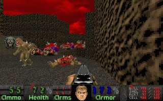 This level is built around what appears to be a volcano - a rocky mountain with a lava cauldron in the middle. The player works his way up the outside, using paths around the edge which dip in and out of caves in the side of the mountain. The design goes for a large scale: little detail, but lots of large impressive views from the paths around the edge of the mountain. The gameplay is fairly good. Some of the fights can be a little bland, as blocks of monsters all of one type are normally used. But the interesting layouts frequently make up for this, giving the player little good cover and making the fights more dangerous.
- Source Control by Jonas Feragen — Okay, who dreampt up this madness? Good level.
- The Descent 2 by Mattias Berggren — A good level, with plenty of big fights and traps. There are tons of ammo and health, but surprisingly little excess, so don't be too wasteful. The main fight is a giant octagonal lift, into which a continual stream of monsters teleports as the lift descends, making one long, tough battle. I particularly liked the way that the mix of monsters changes as time goes on, so, despite being one long fight, you have to change weapons regularly or you will be overwhelmed. The later areas of the level are more conventional: the architecture is good, with a Doom 2 style; the fights are less so, with some big traps, but they tend to have blocks of monsters of one type, which is less interesting than the first battle. The super-secret-level exit is a clever secret, with a distinctive pattern of hidden switches to be found.
- Playground by Jonas Feragen —
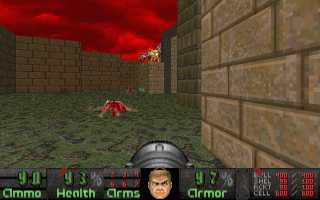 Initially this level looks like a simple example of the Resistance is Futile school of level design: a big yard, packed with monsters, and big side areas that reveal even more later on. The level has a nice symmetry to it: the central building essentially divides the yard into four areas, and there are two platforms in each of these areas each holding a horde of either revenants, barons or archvilles. The layout of connections between the yards and the central building mean that even once the yard is cleared, it is still quite tricky to clear the platforms; and the symmetry carries over into the gameplay, with a switch on each platform needed to release the crucial keycard, and each platform triggering yet another horde of monsters to be released. The architecture, at least the outdoor part, is very well done, with the shape of the yard and the platforms making the level look interestnig as well as play well. On the downside, the player ends up spending most of his time hiding in a passage at far end of the level, peeking out every now and then while letting the monsters slaughter each other; and, while the layout and sequence of switches to hit is interesting, the player eventually works out that the best plan is simply to hit as many as possible before hiding, so they can kill each other on a larger scale. That said, there is still plenty of interesting hide-and-seek with cyberdemons when the time comes to mop up.
Altogether, these make an unusual selection of levels. The first ten maps are really small concept maps; then there are a few big battle levels. Then from MAP15 onwards the levels are larger, fuller levels, with a greater selection of monsters, traps, secrets etc. Then around MAP25 it goes back to concept levels, this time large concept levels. I would say the episode suffers a little from incoherency — there is the odd gothic look of The End is Nigh, for instance.
Early on I was fairly unimpressed, as the episode looked like it might just be a collection of smallish battle levels. The latter half certainly corrected that, and there are certainly some excellent levels here. The Path 2 and The Inmost Dens III deserve better names, as they are outstanding enough to be known as more then just sequels. Jonas Feragen's contribution is more than just numbers, as Reluctant Pain and Mind Trap are both good. Fear of the Dark, Sewer Slaughter and Dis 8000 are all very unusual but good levels.
Of course, if you name an episode Hell Revealed 2, you have to expect a comparison with the original. But there is no comparison; the original is a totally different piece of work, and totally outclasses this sequel. Only half of Hell Revealed 2's levels are in the Hell Revealed style, of massive fights with vast hordes of monsters — and of the levels that are in that style, many are small, and many others are clones of the originals. The clones, by the way, are generally unimpressive, although Hardcore is an exception in that it manages to improve on the original. The bit of Hell Revealed 2 that I liked was mainly not the part that tried and failed to be a good Hell Revealed sequel. The main failure though is understandable: it simply doesn't have the unique oppressive atmosphere of the original Hell Revealed. The music might have something to do with that too.
Overall this is a good episode, though. There are many good levels, and many genuinely clever new levels. It is not that good as a sequel, but once you get into the episode, there is a lot of good original stuff here. Don't be put off by the smaller maps at the start, nor by the number of levels that appear to be simply clones of the original Hell Revealed.