| GP | AR | UV | Overall | CP |
|---|---|---|---|---|
| 5 | 5 | 3 | 5 | 3 |
Review by Colin Phipps
There was a poll some years ago on Doomworld asking people's opinion on the best megawad ever. Requiem was an entry, and if I remember correctly it won (with its predecessors the Memento Mori series in close second). I had the remarkable good luck that it was one of the first Doom 2 PWADs I ever played, long before I ever heard of it or knew of its reputation; I happened to be searching for big downloads on the Compuserve action games forum, and there weren't many bigger than Requiem. I could hardly have picked better then, and even now there are precious few projects that have rivalled it for the top spot.
As a megawad, it is a complete 32 level replacement for Doom 2, and includes a large amount of new textures, flats, music and graphics as well. The new textures are what really binds the episode together; the artists on this project created some very distinctive pieces. Particularly eye-catching are the exotic marble textures, and the stone columns with skull engravings that are used at many of the levels. The new textures cover the whole range of styles though, with brick textyres, metal railings and panels for the industrial levels, wood and metal textures, stone textures and arches for the gothic levels.
These are put to good use in the levels, which have some superb architecture. More than that, levels like Town of the Dead have set the standard for superior architectural tricks, and has become the textbook example for a number of editing special effects. As well as very complicated layouts and good use of textures, they create a very good ambience with good use of lighting to create a sinister atmosphere where needed.
Gameplay is excellent too, of course. Requiem sticks to kind of clever and tricky gameplay which worked so well in the Memento Moris, with lots of traps and use of the basic enemies, rather than the more knockabout style with only tougher monsters used by the likes of Plutonia and Hell Revealed. I probably owe my preference for traps and trickery equally to Knee Deep and Requiem. Although there is a reliance on traps for a lot of the action, these are generally fair and not excessively cruel, so you get a fair shot at beating them first time. I was also impressed with the balance of ammo and health shown at so many of the levels; unlike a lot of megawads, where they give up pushing the player for ammo after the first half dozen levels or so, here I found that even as late as the last 5 or 6 levels I was still not leaving levels even with full shells and bullets. There is also less of an excess of cells — most people must use them far more than I do, because most levels seem to provide enough cells as if they expect you to use them like water, but Requiem is much more sensible and restrained.
I replayed Requiem for the first time in many years quite recently, and took the opportunity to write rather more detailed reviews on the individual levels, since they undoubtedly deserve it.
- The Gateway by Orin Flaharty — A very short level, with lots of those Quake style metal beams. It's quite short, with just basic enemies and no keys, but you are made to work for the shotgun and there are a couple of good traps to get you warmed up.
- Sacrificium by Adelusion, Florian Helmberger —
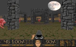 Another small level, but aesthetically this is
one of the most memorable Doom levels I've ever played.
The large outdoor scene is very impressive: it is set on an island with a
causeway leading to a circle of standing stones,
and shows off the excellent new sky texture.
There is some stylish architecture and good detail in the indoor parts
too.
The level is very short in terms of gameplay, though:
you get a couple of good traps and tricky fights,
but I get the impression that this level was placed early more because of
the lack of depth than because of any particular fit in the progression.
- Poison Processing by Iikka Keranen —
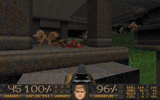 An excellent nukage processing base level.
You start this level on the edge of a lake at the entrance to an icy
canyon, which you follow to descent into the base.
The main part of the base is excellent, keeping the player confined but
giving the impression of a larger network of tunnels.
This level is a good example of how to do a good level early in an episode:
the enemies are weak, but with the tricky layout of the tunnels and
only narrow walkways bordering the rivers of nukage,
it makes the fights close and interesting.
The final part of the level moves away from the tunnels and becomes a bit
linear and less interesting, though.
- Fireworks by Matthias Worch —
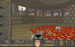 Set in a stone and brick base surrounded by an acid lake,
aesthetically this level gives a very sinister feel with the amount of
acid, the full moon, the spooky music and the decorations.
It is the first really tough level too,
with a number of well devised, dangerous traps.
- The Canyon by Bill McClendon — This is another tough level. It lacks an overall style: it starts out in a Knee-Deep industrial style, but then a later area is Inferno-like, and the final zone is a kind of raised walkway through a long canyon. The individual zones are reasonably well done though, and there are plenty of good fights.
- nataS oT etubirT by Thomas Moeller —
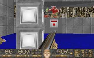 Centred around a building surrounded by an
acid moat, one outstanding feature of this level is the level progression:
you work your way around the central building, crossing bridges
out into the surrounding areas to the key cards and activate more
bridges. The industrial/tech theme extends into the side areas with some
good architecture.
There are plenty of good fights too -
the main buildings and the surrounding ones offer lots of vantage points
for the enemy, so the player has to keep an eye out in several directions
and judge placement well. The side areas have some interesting little
puzzles, good traps and some secrets too.
- Hell's Gift by Jens Nielsen, Matthias Worch — A relatively small level, with the usual Dead Simple battle against mancubi and arachnotrons. But it is very original, using a building in a yard as the centre of the fight to give more variety than the original.
- The Reactor by Iikka Keranen —
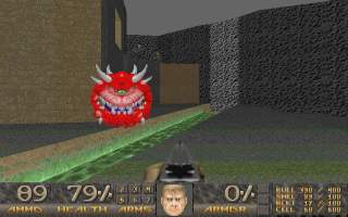
As an individual level, this is an absolute classic and definitely one of my all-time favourites. Actually, it packs in a plot of its own and enough different themes that it would probably have been better as an individual level than contained in a megawad like this: for a megawad, you don't want the individual levels' plots to exceed the WAD itself! You start in an jail, and have to shoot your way out and get into the main building. This sits above a deep shaft which descends through a series of mine tunnels. At the end you come out and blow up the reactor, presumably powering the whole complex; there is a clever trick used to create this effect. That's quite a bit of ground for one level.
The architecture is outstanding. The mine tunnels are carefully constructed with pit props, and are criss-crossed by rivulets of nukage. But these aren't natural tunnels, so it makes sense that they should not be as empty as natural caves. So the author has thrown in some industrial apparatus too, mainly open lifts to connect between tunnels at different levels. This is the only level I can remember where I've seen this combination used, and it works really well. The new textures work really well here, and in the buildings above. Aestetically, the noticable thing about this level is how it creates an excellent atmosphere without tons of decoration. There's no fiddly detailing on every wall just for the sake of filling up space. Instead lighting is used: the dark tunnels with glowing nukage, together with the music make for a very sinister feel that keeps the player glued to the game.
The confined spaces and mechanical features of the mine tunnels set up some good tricky little fights. The tunnels themselves are bases around a central shaft with exits at many different levels. At each level the player has to locate a switch to lower the central shaft and gain access to the next level. This creates a good steady level progression, with lots of little puzzles but nothing too problematic and no searching around for the way ahead needed. The industrial areas are interesting too, in particular with the use of stairs descending into rooms, which force the player to play aggressively and charge down rather than sniping from the doorway. Together with some good traps and secrets it makes a very good level to play.
- Deep Down Below by Matthias Worch —
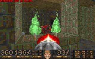 This is a Doom 2-ish industrial style level, although unlike most of those
at Doom 2 this is all underground.
There is a good Knee-Deep-ish computer area, and lots of windows
between areas, and details like torches and gratings that make some
interesting architecture.
The player is made to work hard for the level progression,
with all 3 keycards to locate, and a lot of switches to hit —
there are lots of tricks at this level, with series of switches to hit
where each one releases a few more well placed monsters and a further
switch.
Good monster placement and some tight traps keep this one interesting
throughout.
- The Black Gate by Orin Flaharty —
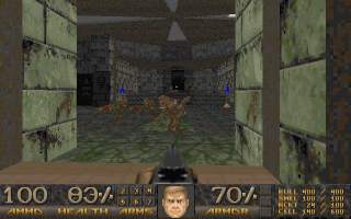 This level is similar to Perfect Hatred (Ultimate Doom E4M2),
with a wood & marble look, with wooden piers above acid areas.
The architecture is very complex with large, impressive marble halls
and many windows or gratings letting you see the areas ahead;
this is something of a sham however because the level is actually quite
linear, so these impressive halls usually only offer one real exit.
There are some good trick fights early on; the main part of the level has
a couple of tricky fights, including a big cyberdemon showdown,
but it is perhaps a bit lacking in depth with some straightforward fights
and plenty of health and ammo.
- Rats in the Walls by Adam Windsor — Nice small tech base level. The title makes me think of the intro sequence from the game Space Hulk (where the genestealers break through a wall and jump down on the marines), but that's not relevant so I'm only mentioning it because I'm too dull to think of anything more interesting to say. Anyway, there are some good fights at this level, particularly in the start area where there is a tricky layout of passages and quite a few monsters wandering around that keeps you looking in several directions at once. Smooth detailed architecture, in particular the little computer monitors on the walls which are very distinctive.
- Militant Reprisal by Ian Quick —
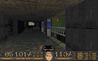
The first time I played this map was back in the doom2.exe days, and with a 486 to boot, so it wasn't a very good experience. The level is quite large — large enough to run rather slowly and also suffer the infamous savegame bug. Actually I think this is the first level I ever experienced the popping speakers phenomenon with the savegame crash (wearing headphones — ouch!), so I was not amused.
Playing this level today with a source port, the weird thing is that the level doesn't feel that large. Correction: the level is big alright, and with quite a complex layout with connecting areas, but the number of monsters is under 200 which is tiny compared with many modern levels, so they are pretty thinly spread here. It brings home how tight the restrictions on levels doom2.exe can play really are.
The architecture is generally quite good, although there are more than a few weirdnesses including some walk-through walls that look like a trivial mistake. The theme varies throughout, starting with bland stone theme reminiscent of Refuelling Base (Doom 2 MAP10), moving in to some industrial areas, some brick-and-metal areas similar to The Darkening, and some Shores of Hell like areas with a more sinister feel. The level progression is just as confusing, with some doors that only open from one side which force the player to retrace their steps for no reason. The gameplay is alright though, with some decent traps and plenty of secrets, and a steady if weak supply of opposition. The level just feels a bit drawn out, both in style and gameplay.
- Town of the Dead by Iikka Keranen —
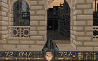
One of the best known Doom levels, this has been an icon for WAD makers for many years. It is a tour de force of the over-and-under bridge in Doom, and is famous in particular for the central feature with bridges crossing over each other at two different levels over a river. The architecture is undeniably top rate; the valley with an acid river is a good setting for a collection of nicely detailed buildings, and the bridges linking them are impressive and give the player plenty to think about. There are some nice new textures used too.
The gameplay is good, although it doesn't really add much and most of the good and bad comes from the architecture. The cramped buildings make for some very tight fights, while the outdoor areas are overlooked by manned bridges, windows and ledges giving the player plenty to dodge. The downside and the irony of this level is that having made an intricate network of buildings and bridges, the cramped conditions these create are the main obstacle so one ends up cursing them in places during play. The level progression is quite nice as you work your way around the buildings and bridges, but offers few surprises as the bridges define the fairly linear route for the latter half of the level.
- The Portal by Eric Sambach — The early part of this level is a couple of mine tunnels connected by a nice lake area. The new textures and music make this one feel very styish, but the architecture is rather simple in places: the mine tunnels in paricular are rather regular and dull when compared to earlier levels in this epiode. There are some good traps and secrets to keep things interesting, albeit with some walk-through walls.
- Last Resort by Matthias Worch — Lots of clever little traps and fights at this level. It has the savegame bug in doom2.exe although only in the early stages. The level progression is poor in places; you have to find what I would consider to be secrets to complete the level. The architecture is good though, with lots of interesting layouts and windows between areas, and good use of new textures.
- Escape from Chaos by Iikka Keranen —
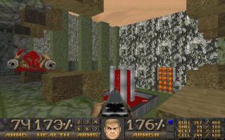 This level starts out a bit weak, with some fairly easy demon chainsawing
and some easily picked off monsters.
It rapidly improves though, and there are plenty of good tricky fights as
the level goes on.
The level progression is quite complex in some places, linear in others;
but the player is usually put where they need to be and you always get
back to somewhere you know so it works out alright,
and there are a few puzzles but nothing too difficult.
The level goes through a strange selection of styles, from the start
area which is a mixture of The Inmost Dens and Circle of
Death (Doom 2 MAP14 and MAP11), then an Inferno-like bit,
through to nukage tunnels echoing MAP03 (Poison Processing).
The individual areas are nicely done though, particularly later on,
and the styles are kept separate so they don't clash too badly.
- Dens of Iniquity by Michael Rapp —
This level turns out to be quite long, although it doesn't appear so initially. The first two keycards can be got within 15 minutes or so, and the player finds the exit not long after that, so it seems like the third keycard should not be far away and the level should be only of average size. That's when you get stuck though, because the third keycard is in a rather non-obvious side area — not exactly secret perhaps, but overlookable when the rest of the level progression seems so straightforward up to that point — when I was definitely expecting the final key to be in that exit area. But no, from that point on the level seems to keep expanding unexpectedly: where the first two keycards are in fairly self-contained areas, the third requires a long trek with a whole series of new areas spanning out. There are a number of teleports used, and an annoying teleport pad which hurts the player, which makes searching the level annoying.
Anyway, having vented about that, I should put it in context and say that that's my only real complaint about the level and it's pretty good otherwise. The main part of the level reminds me of some levels from Memento Mori with some grand but old architecture; the areas fanning out from this are a mixture with some more industrial areas, but the architecture remains impressive. There are plenty of good fights, thanks to some clever traps, good architecture and monster placement.
- Base of Thorn by Eric Sambach — A fairly small hell base level, with some tricky fights due to the way the player is forced to drop into new areas. There are also a number of well placed traps, although these are sometimes given away on the map. The architecture is mostly basic but sound, keeping the texture theme well, and there is a good acid area and a nice lava cave.
- Skinny Puppy by Adelusion — A compact level, with some good fights. The end area is rather poor however; there is a frustrating climb-up-a-lot-of-narrow-pillars-above-an-acid-lake, and some annoying fights.
- The Forsaken Wall by Adam Windsor — A short level with just a couple of significant rooms connected by a small network of corridors, which feels like a misplaced deathmatch level due to its compactness, interconnected corridors and abundance of weapons and ammo. There are more anticlimaxes than fights, with just one significant and tricky fight which is outweighted by the amount of loot present, and the exit is reached within a few minutes.
- Den of the Skull by Anthony Galica —
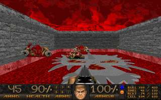 As if to make up for the last level, the next
is huge. It is a strange sort of level; I don't think I've played
any other like it. The level is a mix of good, striking ideas,
puzzles and fights.
There are a number of disjoint parts to the level, connected by
teleports, so the level is a bit piecemeal and you can feel a bit lost.
Lots of times I thought I was stuck, but after some minutes of searching
I would find a new lead. There are some tricky puzzles (can be
frustrating though). There are some clever fights, but some
frustrating instant-death traps and such too.
- Arachnophobia by Iikka Keranen — By the time you reach this point in the episode you can easily spot the Keranen levels without the aid of the titles. This one is like a more sensible version of Town of the Dead: it's a kind of industrial base surrounded by an acid lake, and the quality of the architecture is superb, with lots of windows and ledges looking down on the outdoor area, with overhead bridges and underground tunnels linking the buildings — but the buildings are much more substantial and the bridges less showy that in Town of the Dead. You enter the base by crossing a bridge over the moat, and the initial fight is like entering a castle due to the structures around and above the player, and the number of firing positions around. The level makes its name due to the number of arachotrons both inside the buildings, and firing down into the outside areas, but there is a good mix of other monsters too.
- Hatred by Dario Casali — A real grinding level. The first area uses the archville bug to create a number of ghost SS troopers; you have plenty of rockets, so these are no big problem if you know the trick. The next area is a tedious fight against 2 cyberdemons; you are raised up on a balcony where they can't hit you, so you just shotgun them. The final part of the level is a large collection of buildings to be cleared, with lots of heavyweight monsters and some good fights.
- Proscrustes Chambers by Adelusion —
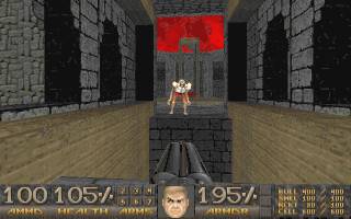 Some nice new textures, and a lot of detail (in particular inverted
crosses) are used to make this level quite stylish.
The architecture is impressive, with lots of arched windows between areas,
and many features including a dungeon, a giant guillotine, and
lots of crucified marines.
The gameplay is more limited;
there are no former human enemies, in fact the level is dominated by
revenants, and these get rather tedious in places where the action is just
one after another.
Ammo is very limited, although
this doesn't really affect play since you have nearly full ammo
from the previous levels,
and the health is all held in a couple of rooms near the exit.
- Chaos Zone by Adam Windsor — A small level, almost cheerful compared to those before it (well lit, even with some grass). The action is pretty unimaginative, just every time you get anything, a load of monsters teleport in for a quick fight.
- Excoriation by Adam Windsor — More sinister than the previous level, this one is however almost trivially small. Just a revenant and an archville for serious opposition, a drop in the ocean compared to earlier levels.
- Cursed Kingdom by Iikka Keranen —
A big outdoor level very similar to Industrial Zone (Doom 2 MAP13). Bright and spacious, in contrast to many earlier levels. Unlike Industrial Zone, the outdoor area is divided up by walls and high walkways, and the player is taken on a highly convoluted path of lifts, rooms, and walkways between buildings to get around the level - getting from one side of the level to another takes some patience and memory. In fact this seems to be something of a hallmark for Keranen levels, with more effort spent on the connections between rooms than on the rooms themselves. While some of the indoor areas are nicely featured, some of them are not: while there's heavy use of the new textures to keep the level becoming drab, this seems to be as much an attempt to disguise the fact that a lot of the rooms are bare cuboids.
While there is some good use of mancubi and arachnotrons to give some power to the windows in buildings, and exploit the complexity of the outdoor areas which together with the complexity of the outdoor areas makes for some good fights in areas, there is an equal tendency to just shove an arachnotron or mancubus behind each corner of a building and make the player tediously work them over one by one. Indoors the level is similarly short on ideas, with some good fights, but equally often the monsters are isolated in small groups in small boring rooms. Essentially, it's a long level and complex level, but with only enough interesting rooms and fights for one rather shorter.
- Fetals' Remains by Adelusion — Nice architecture at this level, which is set around a central lake with buidings in and around it. Lots of good detail and a steady bricks-and-metal-meets-dungeon texture thee. The clever architecture creates fewer good fights than one might expect, with only limited use made of the windows into the central lake area to keep the player looking in more than one direction, and only one trap to speak of.
- Downer by Adam Williamson —
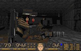 This is good battle, as a penultimate level should be.
This is a good example of a level that sticks to a theme of monster
placement, with lots of imps and chaingunners in cages down the sides
of corridors, lots of monsters behind bars that pop open at testing
moments, and generally lots of traps.
The level can be a little on the nasty side so remember to save,
but you get plenty of health and ammo in return.
The level progression is rather complicated but not frustrating.
- Nevermore by Adam Windsor — Another variation of the battle against a boss spawner. The final battle here is against two spawners, but there's no messing around with balancing on lifts and stuff, once you figure out what to shoot out it's actually quite easy to beat. Nice tech base theme using many of the new textures, not that anyone has time to look at that on a MAP30.
In summary then, Requiem has an amazing selection of levels. With most megawads I like to list half a dozen good levels that stand out, but with Requiem it's hard to list as few as a dozen excellent levels: Sacrificium, Poison Processing, Fireworks, nataS oT etubirT, The Reactor, Deep Down Below, Rats in the Walls, Last Resort, Den of the Skull, Arachnophobia, Proscrustes Chambers and Downer are all amazing levels.
If Requiem has a weakness, it is in composition rather than in the style or the levels. While the levels start small and work up to the bigger levels, in the final third of the megawad there are lots of small levels again. It's fairly clear that a few of the later levels are probably late inclusions to make up the numbers, because they don't really reach the same size or atmosphere of the rest of the megawad.
Setting that aside, Requiem still has an unusual progression. There's a common progression adopted by many Doom episodes, of starting with the industrial levels and ending will the hellish levels; Requiem certainly doesn't do that, with MAP04 looking just as sinister as MAP24. Partly it's a relative problem: whereas some megawads start with some rather tame warm up levels, Requiem has the best first six levels of any megawad I've ever played, so it's hard for the later levels to exceed your expectations. Whether this is a serious problem in a megawad I am not sure; Requiem doesn't add up to more than the sum of its parts in the way that some episodes do, but on the other hand its parts are so good in themselves that perhaps it doesn't need to. Am I making myself sufficiently unclear here? :-)
So, notwithstanding some fairly minor complaints, Requiem is an outstanding megawad. Clearly a lot of effort has gone into it, and it was well worth it. With the arrival of source ports without the savegame bug, there is absolutely no reason for any Doom player not to have played this.